Otomi Embroidery Is for Me

 image otomi pillow bed

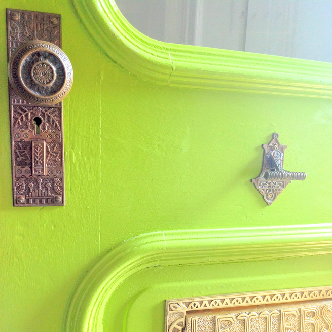
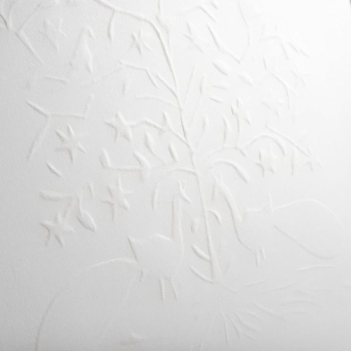
Long, long ago a cute couple got married.  Their wedding was small, simple and lovely and 100% DIY.  And yes, I am talking about my nuptials with my husband Steve 11 years ago.  I didn’t want a traditional wedding at all. I designed and styled the entire beautiful thing using a colorful Indian theme.  The first big decision we made was to create a great invitation with supplies we already had on hand.  The end result was a hand-embossed white invitation.
Letterpress invites would have been wonderful, but instead, I created a template out of cardboard and rubbed the design into the paper.  We chose an image of two Indian love birds (actually a peacock and peahen).

image wedding invitation

 I guess I need to do a post about our wedding, because it was beautiful and there is a lot to tell about it from a design point of view.  But this post is about something that happened after the wedding… the honeymoon.

image sunrise cabo san lucas mexico honeymood

image honeymoon selfie newlyweds cabo san lucas mexico
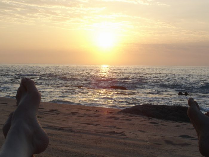
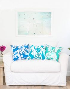
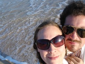
We were really lucky to receive as a wedding gift, a place to stay in Cabo San Lucas for a week.  We used mileage points and flew away to Mexico.  As soon as we pulled up at our hotel I fell in love.  On the benches at the entrance of the hotel were huge, amazing embroidered pillows of animal and plant designs.  What I didn’t know then is that they were examples of a very old Central-Mexican craft called Otomi.  The embroidered images are said to be based on images from cave paintings.

Usually a natural colored cotton fabric is covered with freehand drawings and the embroidery is created by using a satin stitch over the drawings.  The animals (deer, birds, armadillos…) and plants depicted are usually seen in profile. Stitched in beautiful bright colors, they are stunning.

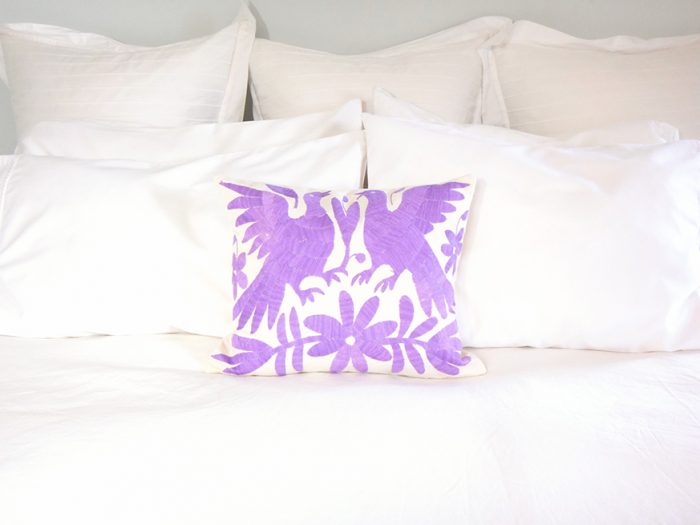
Since Mexico is so inexpensive we were able to stay within our travel budget, and purchase some gifts for people.  The one thing I really wanted as a souvenir for myself was a bunch of Otomi embroidery pillows.  One day we went to the lovely town of San Jose del Cabo to shop, and I was really bummed out when we discovered that Otomi was actually quite expensive.  I had imagined getting many sham sized pillow covers for our apartment.  After lots of contemplation we splurged and bought ONE 12″ x 16″ embroidered piece of fabric showing Mexican love birds, reminiscent of our wedding invitations.

That lovely Otomi embroidery piece sat stored in a bin with antique lace and linens that came from my grandparents’ house for 11.5 years (we moved that bin twice).  So, today the big news is that I rediscovered it, picked a fabric for the backing (from my famous fabric stash) and had my mom create a pillow cover.  We finally have it on our bed.  I would still love to have more Otomi, but after so long I am good with our little purple love birds.

image otomi pillow bed home decor

xo

Elizabeth

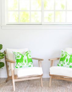
You can buy some amazing Otomi pillows like those pictured below, from The Little Market.


Continue Reading

Thrift Store Secret: Down/Feather Pillow Inserts

image down feather pillow inserts
I think throw pillows look great with goose down/feather inserts.  The poofy-ness and the squishy-ness scream luxury.  On the other hand, fiberfill inserts fall kind of flat but they are very affordable and readily available. But I need down/feather inserts for the throw pillows in my house and I have figured out a way to find them for less than $5 a piece!  They aren’t that expensive, but I see no need to buy new when I can reuse and save money at the same time while getting the look I love.

Even though the pillow racks at thrift stores might give you the willies, (you know, dust, mildew, etc.) I have learned over the years not to be afraid of thrift store throw pillows.  You just need to be brave and give those dusty old pillows a little squeeze.  You can easily identify a down/feather insert vs. fiberfill.  When you find a pillow with a squishy-feather filled feel, buy it!

image pillow inserts down feather

Continue Reading

Selling The Bungalow We Used to Call Home

We lived in our old house, a Chicago bungalow, from 2006-2013.  Over those 7 years we did countless projects including updating the kitchen and remodeling the bathroom.  When Harper was born we changed Trixie’s nursery into a room for them to share.

Here are pictures from 2013 when we were putting our house on the market in preparation to move to our current home.  Since we were getting the house ready to sell, we swapped our living room and dining room to their original and intended layout.  You can see our unorthodox set up in The Bungalow We Used to Call Home.

2006 was the height of the real estate bubble, and when we were selling in 2013, it certainly hadn’t recovered anywhere close to the 2006 levels (you can read all about that in my DesignMom interview), but even in that sluggish environment, our house was under contact within a week of putting it on the market!

Last week I posted some very striking before & after photos of the old bungalow.

Also check out the posts about our new house:


Selling the Bungalow


Living Room

image living room arts & crafts bungalow

The brick fireplace-surround in the living room was painted brick red when we moved in.  I painted it ivory to lighten up the space.

image living room arts & crafts bungalow

So many wonderful, original old windows, we had them all restored rather than replaced!

Continue Reading

You’ve Gotta Be Crewel to Be Kind

When I am thrift shopping I always look for antique and vintage things that are handmade.  Generally, the quality and materials are better than anything you can buy new.  Knit sweaters and mittens, embroidered pillows, crocheted afghans, needlepoint and crewel work and more.  When I was growing up my mom was always working on some such project, in between making clothes, and I know the tremendous amount of time that is involved in each creation.  It is more time than I am willing to put into any one craft but I truly appreciate every one-of-a-kind work-of-art I find.

The other day I found two pieces of groovy 70s Crewel work, which is embroidery with a wool yarn.  They looked very sad lying there along among the teddy bear posters and framed country scenes, they had to be saved.  I am sure both pieces were made by the same person because of the colors and the very unconventional way they were mounted and framed.

image crewel work picture mushroomsThe first one, seen on the left here, is a small piece with mushrooms, a bee and a snail = 1970s cute.  It cost 49 cents.

Once I got it out of the “frame” and removed the layers of ancient tape and staples, I plunged it into cold water to clean off decades of dust.  Then all it needed with a good pressing with some steam to look super crisp and like new.

A simple white frame was the perfect way to keep it looking modern.  I got an IKEA frame from my stash (I always grab imperfect frames at IKEA from their “seconds” area) and it looks great, as you can see below.  It will be a great addition to the playroom walls.

image crewel work picture mushrooms

The second piece will take a lot more work to get it rehabilitated, more on that soon.

xo

Elizabeth

Continue Reading

The Bungalow We Used to Call Home – Before & After

We were thrilled to find our first house in Berwyn, Illinois, 10 miles from downtown Chicago and on the commuter train line.  After looking for an entire year (thanks to our patient realtor Chris) we found a gem – a Chicago Bungalow with all of its original woodwork and character.  We were only the third owners of this 100-year-old home. It needed a lot of work: repair on the stucco exterior, electrical rewiring, insulation, window restoration, storms and screens, a new chimney, a roof, as well as cosmetic work throughout.  Over the seven years we lived there, we attacked all of those updates as well as remodeling the bathroom, updating the kitchen, adding a fence and designing gardens around the entire property.

(Please excuse the not-so-good quality of the photos) 

Front Porch

BEFORE

image bungalow chicago front porch

The house was painted white with wedgewood blue trim.  I really wanted to embrace the natural, neutral colors that were popular in the Arts and Crafts movement.  Painting windows a dark color on a light colored house always gives it a real punch.  For the trim I chose an earthy khaki color.  We replaced the house numbers with ceramic tiles from Rejuvenation Hardware.

The porch swing belonged to my grandparents. I remember my grandpa taking it off of its frame in the yard and putting in the garage when it rained.  I would always ask him why he didn’t just leave it out in the rain and he would say that you need to take care of things if you want them to last.  I staked a claim on that swing long ago.

AFTER

chicago bungalow front porch

Continue Reading

The Bungalow We Used to Call Home

We moved into our first home in 2006.  It was a wild ride.  I was almost nine months pregnant and my water broke the morning after our move-in day. We had had a rough night sleeping on a slowly deflating air mattress in our mostly-empty old apartment.  Trixie came 3 weeks early.  
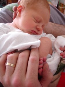
I was looking forward to those weeks to do some unpacking, but instead we spent 5 days in the hospital and then brought home a gorgeous, healthy baby girl to our new house filled with boxes.
Our first night in our first ever house was our first night home with a baby!  My mom and a few other family members worked hard unpacking the necessities when they weren’t with us in the hospital.  Needless to say, most of those boxes stayed packed for a long time.  Some of them are still packed in our current basement – no joke.

About 2.5 years later, in 2008, I introduced a new product line of cashmere baby items to my business Kistner Supply.  As part of promoting the new line I worked with Gabby Blair at DesignMom.com to do a home tour for Cookie Magazine.  These shots are from that 2008 tour and interview.

Our house was a typical 2.5 bedroom/1 bath 1000 square foot Chicago bungalow.  Like many bungalows,

image floor plan
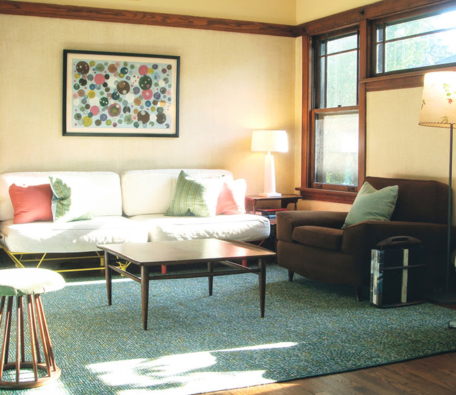
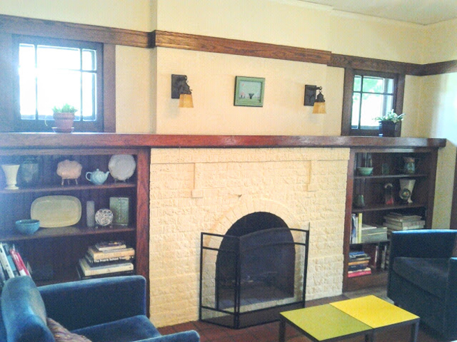
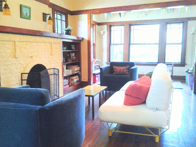
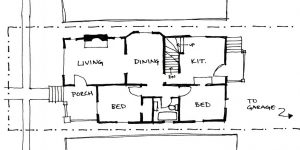
you enter into a small foyer, then into the living room and you walk back through the dining room to get to the kitchen.  The entrance to the bedrooms and bath are through the dining room.

In our home I decided to switch the living and dining rooms so that the main living space wasn’t all the way in the front of the house.  The end result was a larger space that didn’t have to work around an entry and fireplace, and that was closer to the bedrooms and an eat-in kitchen.  When we put the house up for sale in 2013 I switched them back to the traditional layout.

To see what the house looked like when we put it on the market stay tuned for another post coming soon.

Also coming soon is a before & after post of our old house.

And of course you can see these three tours of our current home: Before & After, Holiday Tour and The Old House We Love to Live In.

Living Room

image living room bungalow arts & crafts

We fell in love with the original woodwork in the house and the grass-paper wallpaper.

The coffee, endtables, stool and magazine rack belonged to my parents in the 1960s and the large brown chair was something my grandparent’s purchased in the 1950s (at one point it was upholstered in brown vinyl!).

Continue Reading

The Old House We Love to Live In – Before & After

As soon as I saw this 150-year-old house in Charleston Illinois I knew that we could make it our own.  It was dirty, dark and unloved but had so much potential to be a happy and bright family home.  You can read more about what brought us to Charleston in my interview with Design Mom.

Don’t forget to see the posts of our home tour and our house decked out for the holidays.

Exterior

BEFORE

image old house before

The house was white with decorative green shutters for at least 100 years.  After living here for 2 years I decided that we needed to go dark.  I love the monochromatic Colonial homes in New England, especially Massachusetts homes like The House of Seven Gables and The Orchard House that were built in the late 1600s.

In 1864 our house was originally built in the Carpenter Gothic style.  Then in 1920 the second owners added a Georgian Colonial Revival style by changing the facade. The gingerbread trim and the porch were removed and a portico with columns was added.  The bay windows in the front of the house were replaced with french doors.

I found the combination of styles confusing and think that the monochromatic, dark paint job solidified the look.  We chose Sherwin Williams color Dark Knight for the exterior with Nervy Hue for a pop of color on the door.

AFTER

image, old house after

Continue Reading

An Old Clock Repurposed – Before & After

image clock with wood grain face

It was a sad day when this clock broke.  It was just an office clock from Target, but I loved the fake wood and the minimal  font.  Oh well.  Months ago our kittens somehow knocked it off the wall and it couldn’t be repaired.  Steve wanted to chuck it, but I wanted to save it (imagine that!).

I figured that some day, I would have something round that I would want to frame.

Continue Reading

The Old House We Love to Live In

We moved into our 150-year-old home in Charleston, Illinois in the fall of 2013.

Right now we are looking forward to Spring (but also wishing for some late February snow).

Here is a shot of the exterior of our house from last Spring with the dogwood tree (aka Harper’s tree) and the groundcover on our hill in bloom.  Every year we add more drought-tolerant perennials with the hope that one day the steep hill will be covered in color.  I really enjoy mixing different heights, textures, and colors to create a patchwork of lovely for all to see.  I grew many of the plants from seed and some came all the way from our last home.  We love to garden. We moved from a typical Chicago postage-stamp lot to a huge yard that hadn’t been tended to for decades.  There are always so many projects going on at once. It is a lot of work, but is so rewarding each year.

In the fall of 2015, we painted our house in Sherwin Williams Dark Knight, with a slightly darker custom-mixed trim in a glossy finish.   The house had been white with (decorative) green shutters for at least 100 years so we get lots of double-takes from passersby.  It took courage to go for the dark color, especially since we are a relatively new family to a very small rural community, but I am so glad we took the risk.  The house looked disjointed before, starting out as a Carpenter Gothic in 1864 and then being morphed into a more Georgian Colonial Revival style in 1920.  I think the dark color solidifies the look.

Since we moved here we have made many changes.  Here are the most recent shots of the house interior.

Take a look at our Holiday House Tour for even more photos.

To see what the house looked like before we moved in check out the  “before and after” post.


Front Door

picture of front door

This color is Sherwin Williams “Nervy Hue,” isn’t that a perfect name!  The doorbell is original and in perfect condition, the door plate and knob were eBay finds (We ordered many and tried them and resold the rejects, it was hard to find the right fit.  Who knew antique door hardware was so complicated?!) and the mail slot is a reproduction from Signature Hardware.

Continue Reading

Chest for the Mudroom – Before & After

In our old house we made a great little mudroom.  Last week I showed you the before and after of the bookcase I used for shoe storage.  Well, across from the shoe shelf there was room for another storage piece.  This time I went rummaging in my basement and found this old chest.

image chest unpainted

It was from my grandparents’ bedroom.  When my mom and I were cleaning their house out I was working in their bedroom and right inside the door there was a pile of laundry.  There was always a pile of laundry there.  I never really thought about it because I knew it was clean, folded laundry.  I guess I assumed that the pile was sitting on a table, but it wasn’t.  It was set on top of a chest and the chest was covered with a small blanket.  Total mystery piece.  My mom had never noticed it before either so we have no idea where it came from.  I am not a fan of its style, which I call “pirate-ship chic,” but I guess it’s really “Early American,” I decided I would put it into my storage space with all of the rest of the furniture and “treasures” I found.  Finally it came in handy.

Sanding, primer, red glossy paint did the trick, just like with the bookcase.  I had some Marimekko fabric leftover from working on a girls’ 1980s bedroom for the John Cusack movie “High Fidelity” (I save everything cute!).  I added some poly fiber fill from old pillows and stretched the fabric over the top and the back piece.  Now it’s a colorful and comfy place to sit, perfect for a mudroom.

image painted chest

Hold on to those old, good quality pieces and repurpose them!

xo

Elizabeth

Continue Reading