Thrift Store Secret: Down/Feather Pillow Inserts

image down feather pillow inserts
I think throw pillows look great with goose down/feather inserts.  The poofy-ness and the squishy-ness scream luxury.  On the other hand, fiberfill inserts fall kind of flat but they are very affordable and readily available. But I need down/feather inserts for the throw pillows in my house and I have figured out a way to find them for less than $5 a piece!  They aren’t that expensive, but I see no need to buy new when I can reuse and save money at the same time while getting the look I love.

Even though the pillow racks at thrift stores might give you the willies, (you know, dust, mildew, etc.) I have learned over the years not to be afraid of thrift store throw pillows.  You just need to be brave and give those dusty old pillows a little squeeze.  You can easily identify a down/feather insert vs. fiberfill.  When you find a pillow with a squishy-feather filled feel, buy it!

image pillow inserts down feather

Continue Reading

The Old House We Love to Live In – Before & After

As soon as I saw this 150-year-old house in Charleston Illinois I knew that we could make it our own.  It was dirty, dark and unloved but had so much potential to be a happy and bright family home.  You can read more about what brought us to Charleston in my interview with Design Mom.

Don’t forget to see the posts of our home tour and our house decked out for the holidays.

Exterior

BEFORE

image old house before

The house was white with decorative green shutters for at least 100 years.  After living here for 2 years I decided that we needed to go dark.  I love the monochromatic Colonial homes in New England, especially Massachusetts homes like The House of Seven Gables and The Orchard House that were built in the late 1600s.

In 1864 our house was originally built in the Carpenter Gothic style.  Then in 1920 the second owners added a Georgian Colonial Revival style by changing the facade. The gingerbread trim and the porch were removed and a portico with columns was added.  The bay windows in the front of the house were replaced with french doors.

I found the combination of styles confusing and think that the monochromatic, dark paint job solidified the look.  We chose Sherwin Williams color Dark Knight for the exterior with Nervy Hue for a pop of color on the door.

AFTER

image, old house after

Continue Reading

An Old Clock Repurposed – Before & After

image clock with wood grain face

It was a sad day when this clock broke.  It was just an office clock from Target, but I loved the fake wood and the minimal  font.  Oh well.  Months ago our kittens somehow knocked it off the wall and it couldn’t be repaired.  Steve wanted to chuck it, but I wanted to save it (imagine that!).

I figured that some day, I would have something round that I would want to frame.

Continue Reading

The Old House We Love to Live In

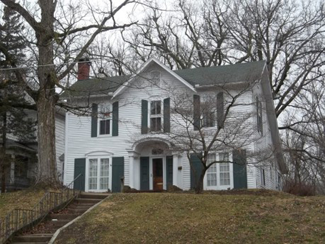
We moved into our 150-year-old home in Charleston, Illinois in the fall of 2013.

Right now we are looking forward to Spring (but also wishing for some late February snow).

Here is a shot of the exterior of our house from last Spring with the dogwood tree (aka Harper’s tree) and the groundcover on our hill in bloom.  Every year we add more drought-tolerant perennials with the hope that one day the steep hill will be covered in color.  I really enjoy mixing different heights, textures, and colors to create a patchwork of lovely for all to see.  I grew many of the plants from seed and some came all the way from our last home.  We love to garden. We moved from a typical Chicago postage-stamp lot to a huge yard that hadn’t been tended to for decades.  There are always so many projects going on at once. It is a lot of work, but is so rewarding each year.

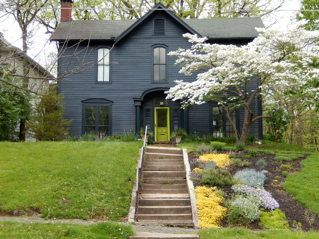
In the fall of 2015, we painted our house in Sherwin Williams Dark Knight, with a slightly darker custom-mixed trim in a glossy finish.   The house had been white with (decorative) green shutters for at least 100 years so we get lots of double-takes from passersby.  It took courage to go for the dark color, especially since we are a relatively new family to a very small rural community, but I am so glad we took the risk.  The house looked disjointed before, starting out as a Carpenter Gothic in 1864 and then being morphed into a more Georgian Colonial Revival style in 1920.  I think the dark color solidifies the look.

Since we moved here we have made many changes.  Here are the most recent shots of the house interior.

Take a look at our Holiday House Tour for even more photos.

To see what the house looked like before we moved in check out the  “before and after” post.


Front Door

picture of front door

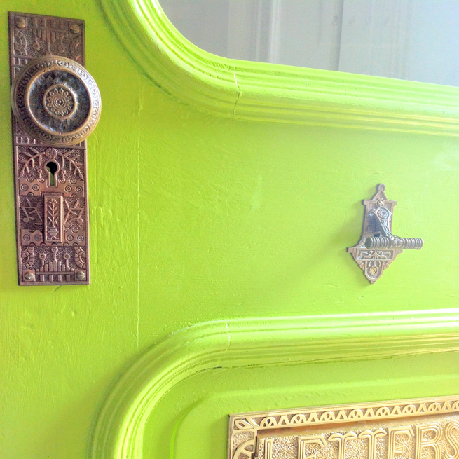
This color is Sherwin Williams “Nervy Hue,” isn’t that a perfect name!  The doorbell is original and in perfect condition, the door plate and knob were eBay finds (We ordered many and tried them and resold the rejects, it was hard to find the right fit.  Who knew antique door hardware was so complicated?!) and the mail slot is a reproduction from Signature Hardware.

Continue Reading